
Short answer
How do you build a logo whose shape repeats the product's name?
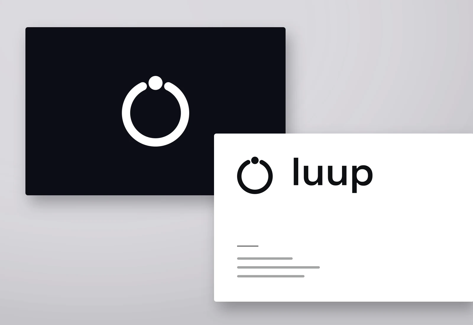
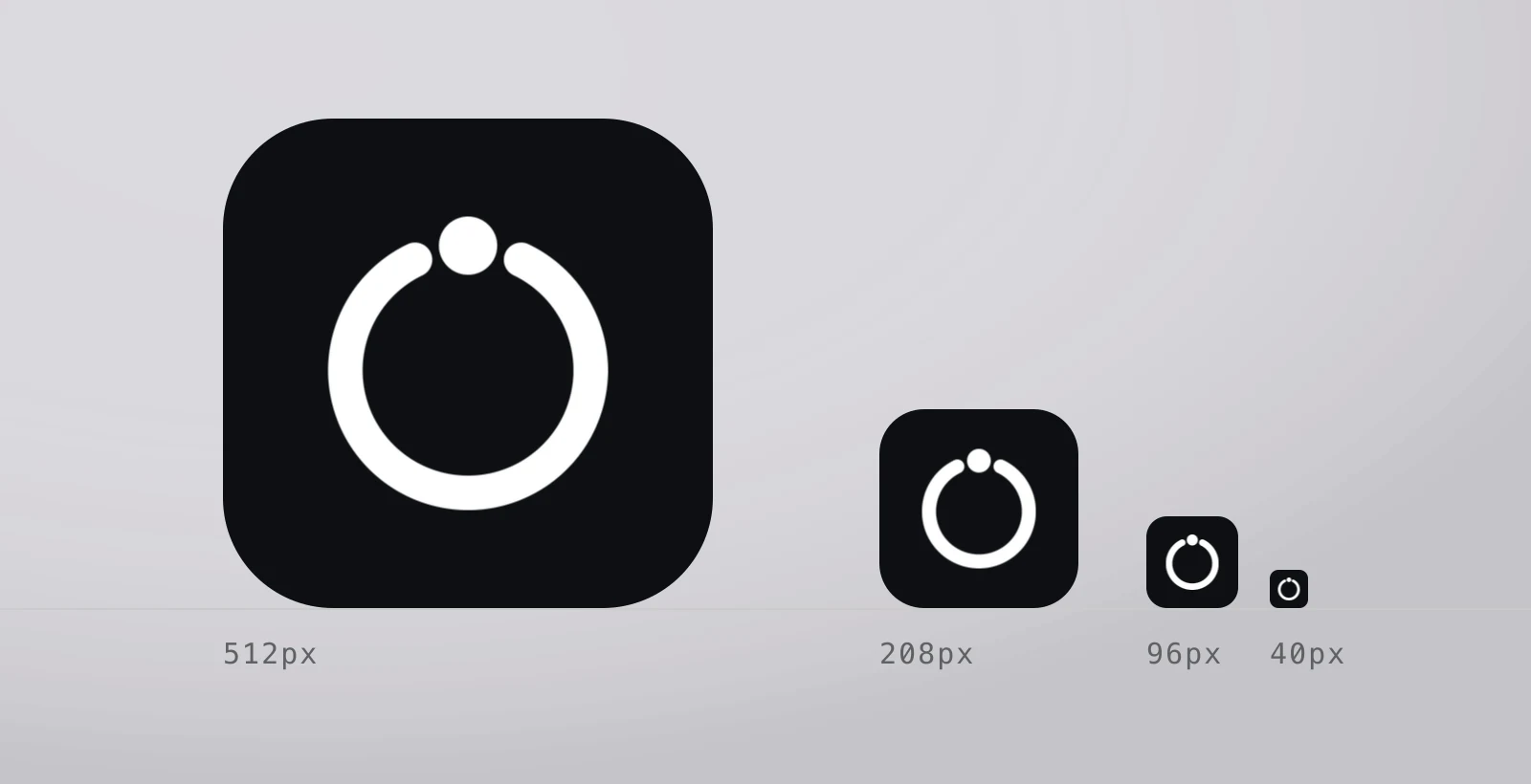
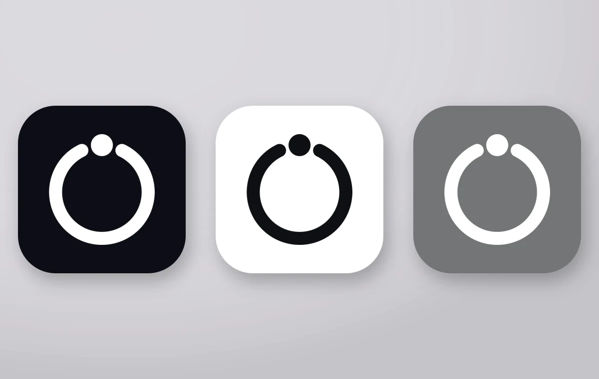
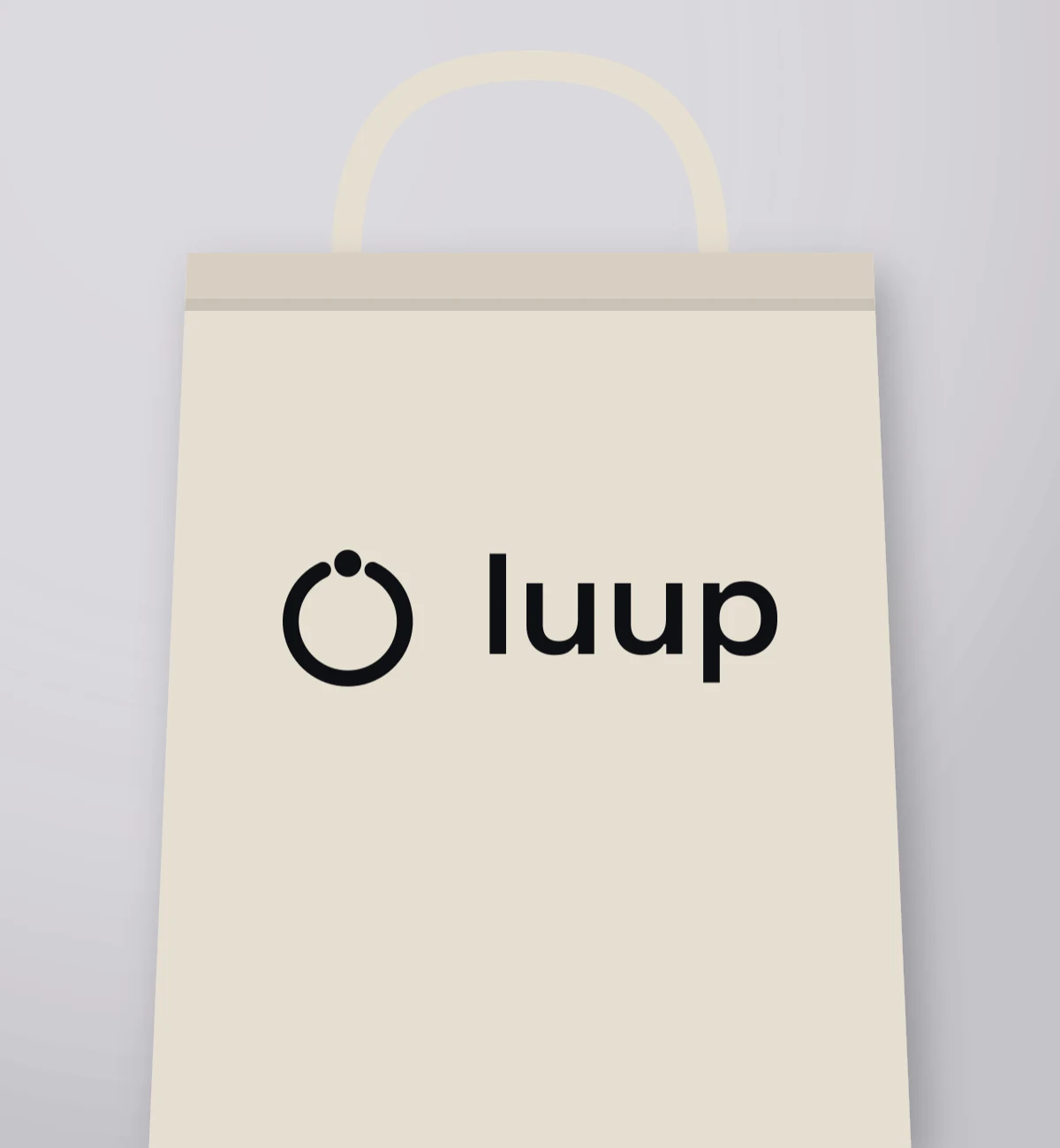
The voice-AI mark Galata Media drew is the closed form of the double 'u' inside the brand's name: a ring carrying a single dot above it. Because mark and wordmark repeat the same geometry, the lockup is not two elements standing side by side but one idea said twice. Working in a single near-black (#0d0f13) continues the high-contrast line of the product interface.
Key takeaways
- When the mark is derived from a letter of the wordmark, the lockup reads as one idea; an unrelated symbol reads as two separate things.
- Matching the ring's stroke to the stem weight keeps mark and type at the same optical mass.
Applications
Palette
#0d0f13#f2f2f4
Construction
The ring's stroke equals the wordmark's stem weight, and the dot sits at the same optical height it would have over an 'i' that is not there.
Queries this page answers
- product logo design
- monogram logo
- app logo design
Let's talk about your project.
A new brand, a website that needs rebuilding, or visibility in search — tell us where you want to start and we will map the route with you.