
Short answer
Why can a brand's logo be the word and nothing else?
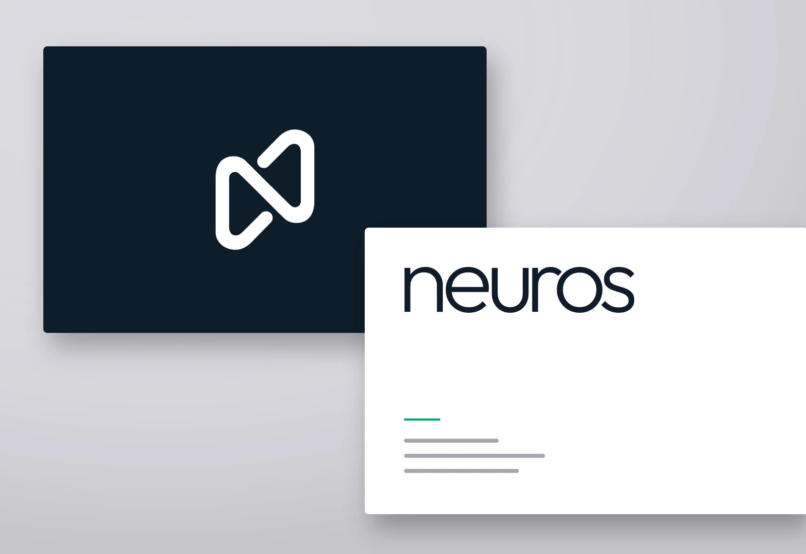
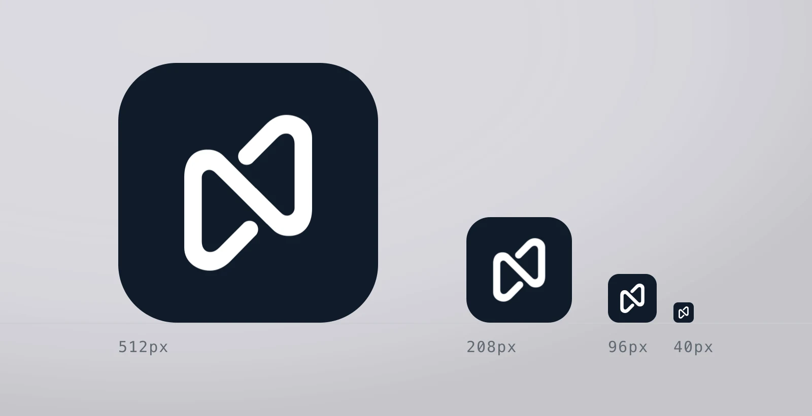
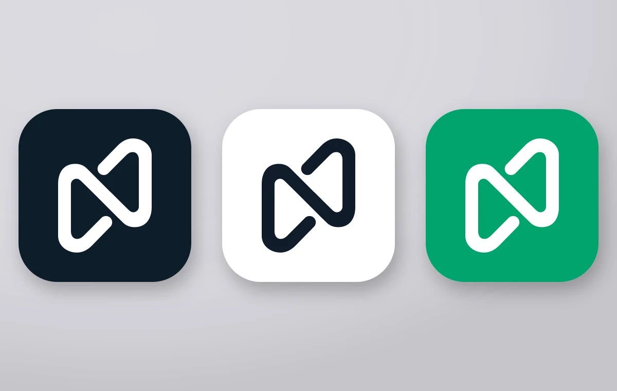
The software company logo Galata Media delivered is the word itself; no symbol stands beside it. The symbol — a single continuous 'n' ribbon — is a separate mark, used only where a container must be filled — an app icon, a profile picture, a card back. The split is scale. On a sign the word reads wide and calm; at 40 pixels it is unreadable, and one shape in a filled square works.
Key takeaways
- Separating the wordmark from the symbol gives a brand the right answer at two different scales; one lockup cannot give both.
- A mark whose counters are real holes is a one-colour mark — a reversed surface asks it for a colour change, not a second file.
Applications
Palette
#0f1b2a#00a36c#f6f7f9
Construction
The ribbon is one continuous stroke of constant weight, folded back on itself to build the 'n'. Its counters are cut as real holes, so the mark shows the colour of whatever it is placed on: white in a dark tile, navy in a light one. Reversing it asks for a colour change, not a second drawing.
Queries this page answers
- technology logo design
- software company logo
- brand identity example
Let's talk about your project.
A new brand, a website that needs rebuilding, or visibility in search — tell us where you want to start and we will map the route with you.