
Short answer
What stands in for the brand where the wordmark cannot be read?
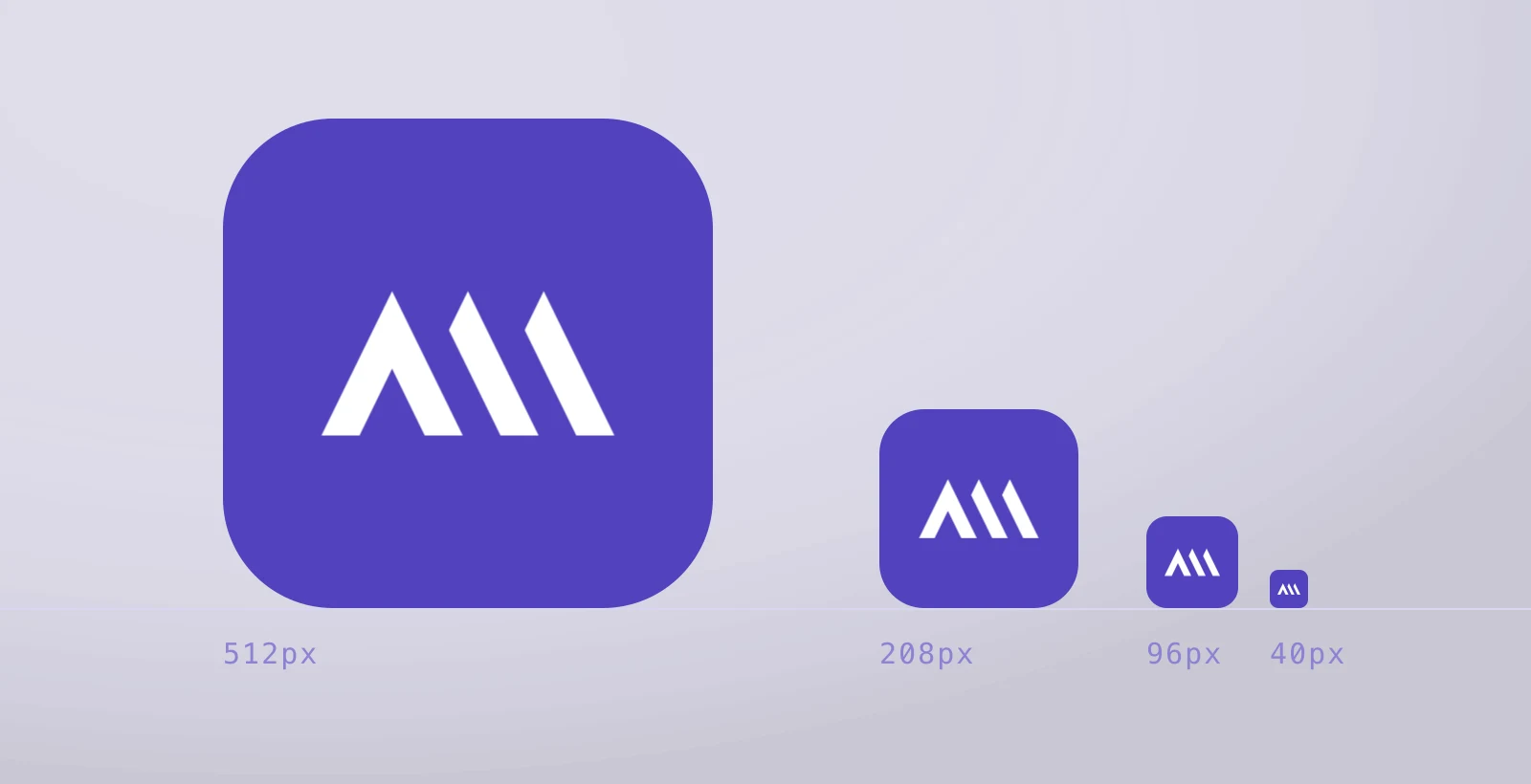
On the retail-analytics product Galata Media built the identity for, the lockup is two pieces: a symbol of three ascending bars and the wordmark beside it. At 40 pixels the wordmark stops being readable and the symbol does not — so the two ship separately, and the minimum size is tested rather than assumed. The identity runs on a single violet (#5142bd); a reversed surface needs one colour change, not a second drawing.
Key takeaways
- The wordmark and the symbol ship as separate files; at 40 pixels it is the symbol that stands in for the brand.
- With the gap between bars held equal to the bar weight, the symbol still reads as three distinct bars at its smallest size.
Applications

Palette
#5142bd#131210#fbfaf7
Construction
Three bars rise at the same angle and the gap between them equals the bar weight — the equality that stops them closing into each other as the mark shrinks. The symbol is lifted out of the lockup on its own bounding box; it is never redrawn.
Queries this page answers
- logo symbol vs wordmark
- minimum logo size
- identity design
Let's talk about your project.
A new brand, a website that needs rebuilding, or visibility in search — tell us where you want to start and we will map the route with you.