← Work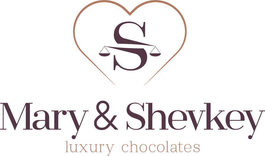
Logo and packaging identity for a chocolate brand
- Services
- Logo & Identity
- Sector
- Food — artisan chocolate
- Year
- 2024
Short answer
How does a luxury food brand's logo hold up on packaging?
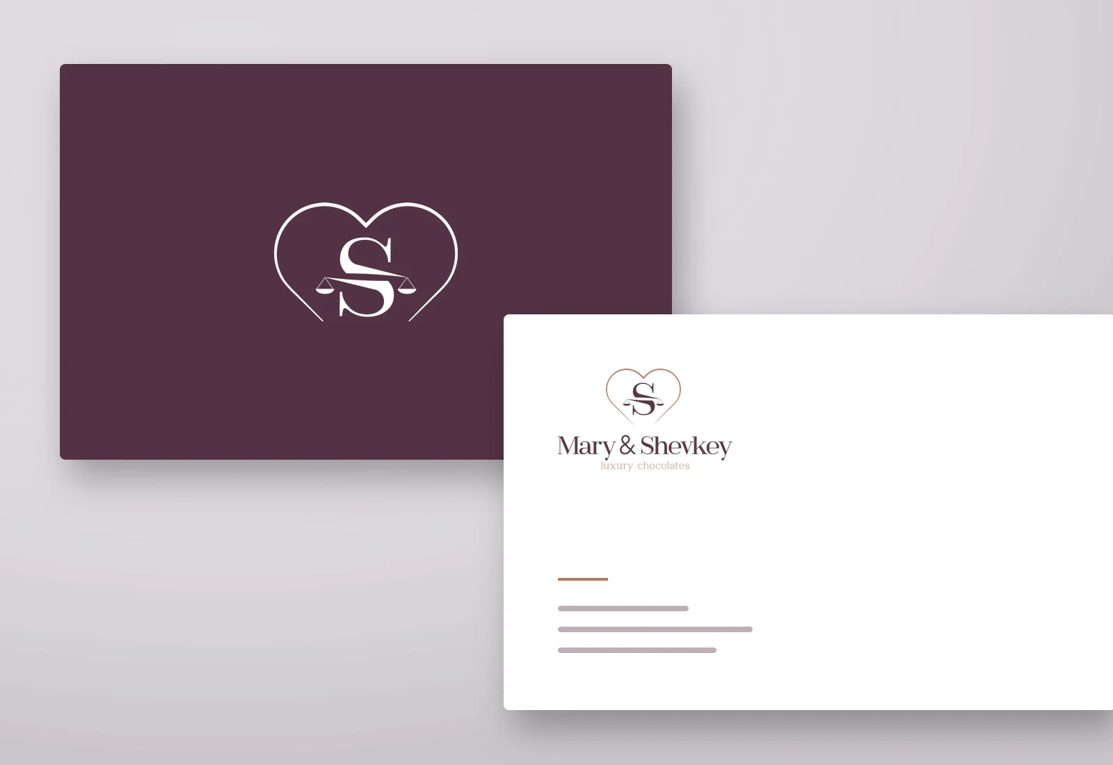
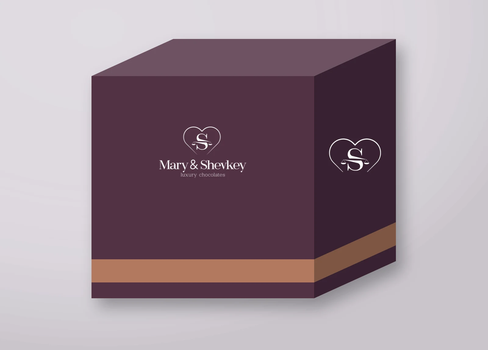
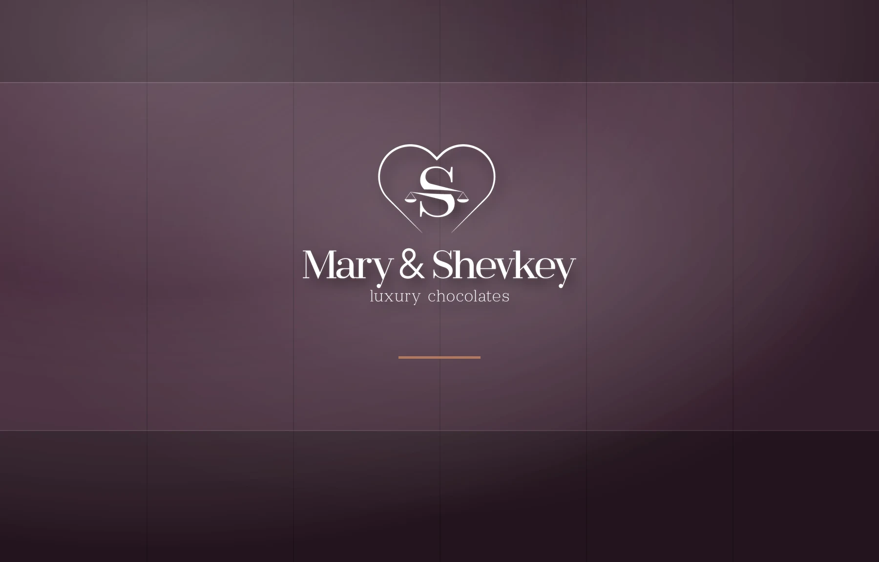
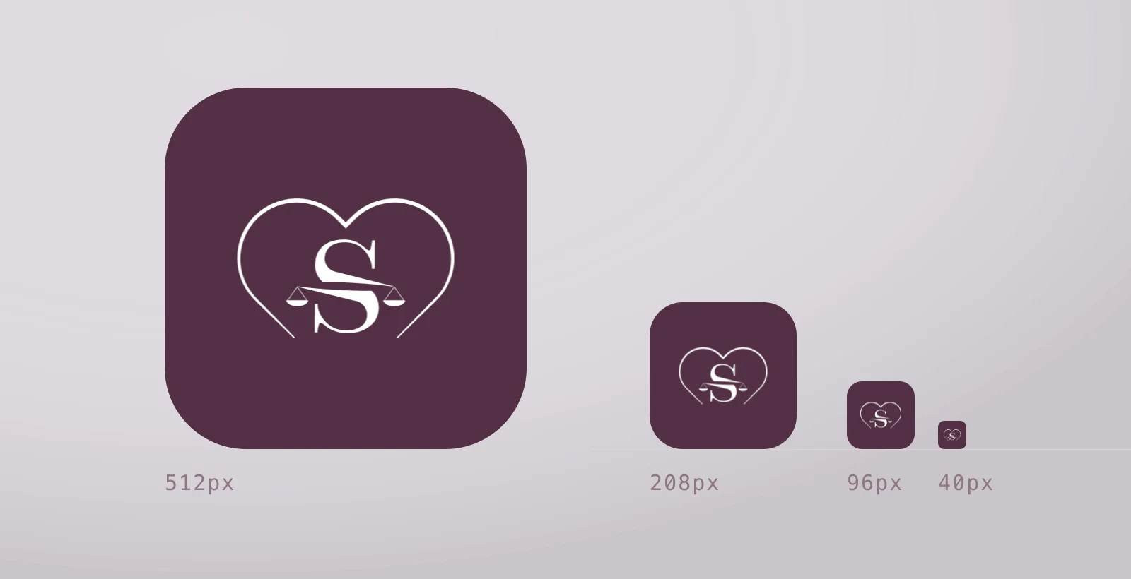
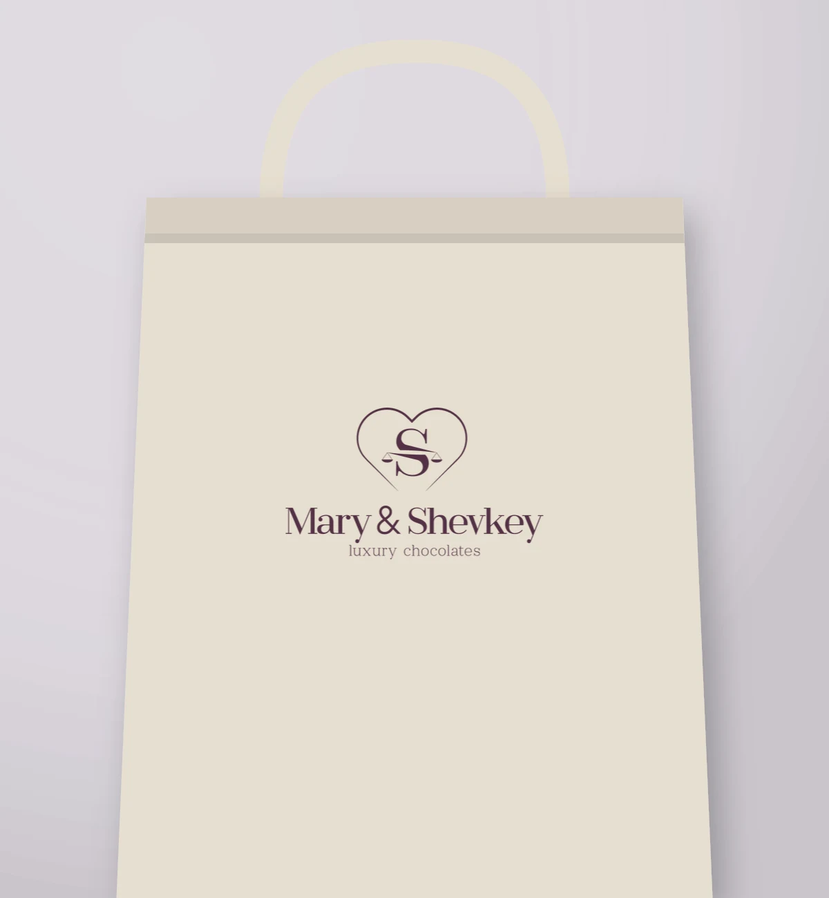
The artisan chocolate identity Galata Media built pairs an S monogram set inside a heart contour with a serif wordmark beneath it. The palette rests on two colours: deep plum (#533744) and copper (#b17b63). Because the monogram works apart from the wordmark, the same brand can appear as a full lockup on packaging and as a bare mark on signage and a profile picture.
Key takeaways
- Because the heart contour and the S monogram work apart, the brand keeps its identity on surfaces where the full lockup does not fit.
- The copper tone (#b17b63) misses the contrast threshold as text on white, so it is used only as an accent and a rule.
Applications
Palette
#523044#b3795f#f4ece6
Construction
The monogram aligns to the heart's optical centre rather than its geometric one. Centred geometrically, the S appeared to sag below the middle.
Frequently asked
Is packaging design part of the identity work?
- The identity work sets the rules for packaging: at what scale, on which colour and with how much clear space the mark may be used. The print-ready packaging file itself is a separate item, since material, die size and print method are settled with the printer.
Queries this page answers
- chocolate brand logo
- packaging design
- artisan food brand identity
Let's talk about your project.
A new brand, a website that needs rebuilding, or visibility in search — tell us where you want to start and we will map the route with you.